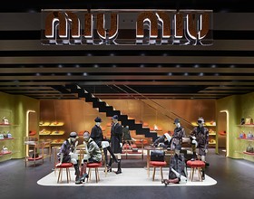
MIU MIU AOYAMA STORE
-
"Contrary to expectations for a site that is home to so many luxury brands, Miyuki Street in Aoyama Tokyo is not particularly beautiful or elegant. The architecture is heterogeneous – a hodgepodge of freestanding buildings of different heights and shapes, with neither historical tradition nor common standards. Never meant to be a space of its own, the street is a purely technical and functional link between Omotesando and the Aoyama Reien cemetery farther down the road. Despite single trees here and there, the atmosphere is not inviting, like a boulevard or a plaza. Tokyo is pure, quintessential city, its territory exploited to the full with absolutely no leeway for the individuality that we take for granted in European cities.
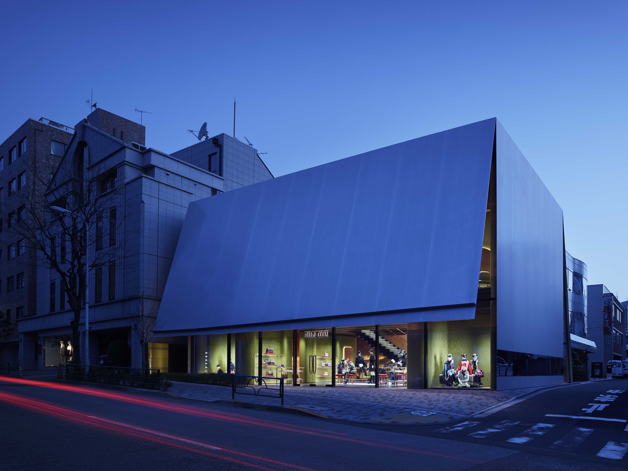
Over the past decade, the distinctive building has become a much-frequented location and it was therefore important to Prada, our client Prada Japan and also to us as architects to take this into account in planning the Miu Miu store located in the immediate vicinity on the opposite side of the street. We started out by trying several different architectural typologies. Since zoning regulations called for less height, we explored the potential of a smaller, more intimate building. We used the following thoughts to channel our ideas: more like a home than a department store, more hidden than open, more understated than extravagant, more opaque than transparent.
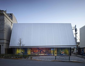
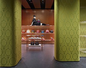
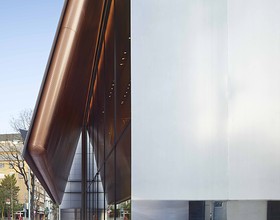
The typological model that best suited these considerations and specifications was a box placed directly at the level of the street, its cover slightly open to mark the entrance and allow pedestrians to look inside. Only then do they realize that the building is a shop. Here, under the oversized canopy, the two-storey interior is visible at a single glance, as if the volume had been sliced open with a big knife, turning the inside out. The rounded, soft edges of the copper surfaces inside meet with the razor-sharp steel corners on the outside of the metal box, while the cave-like niches clad in brocade face the central space of the shop like loges in a theatre.
The façade has neither logo nor pomp; it is a polished, mirror-smooth surface, as if one single giant brushstroke had swept smooth the ordinarily matte surface of the steel panelled façade. This surface attracts the gaze and curiosity of passing pedestrians. But instead of affording a view inside, as in a shop window, the gaze is inverted; instead of the anticipated see-through window, viewers encounter self-reflection."
Photo credits: Nacasa & Partners
1869 Projects

