LA SERENISSIMA OFFICE BUILDING
-
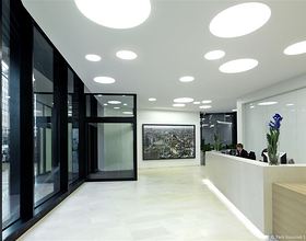
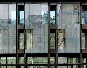
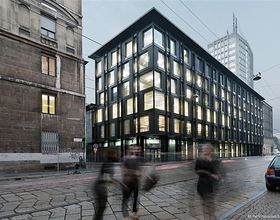
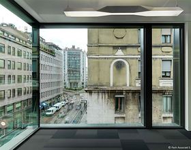
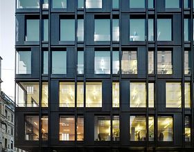
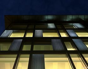
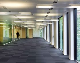
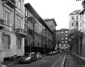
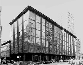
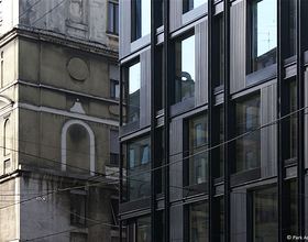
This building, designed in 1962 for the Campari company by the Soncini brothers, is distinguished by the burnished colour finish of the metal structures on the facade, the tinted glass of the curtain wall system, the brown paintwork and the smaller volume used as a residential unit. During its heyday, the building would have been considered modern and technologically advanced. However, in its contemporary condition, many of its undeniably fascinating aspects have proved to be uneconomical particularly in terms of energy saving. The new owner has decided to redesign the building respecting the original layout. The design choice has been to recuperate the ground floor and to reassign its generous amount of unused space to commerce (although part of the central green area is kept), and to aim at a new distribution and increased flexibility of the internal office spaces. Particular attention has been paid to the system of façades. By shifting back the perimeter façades of the building, it has been possible to gain approximately 360 sq m of overall floor space. This result has also been achieved by creating of a glass skin of variable modules that is able to recompose, like a soft and transparent sheet, the new distribution of the spaces of the ground floor, now accessed via a single entrance. At the end of the whole process of redefining the façades, all of the same style and height, it was decided to emphasize the overhang of the roof, adjusting it to the dimensions of the redevelopment. Awards Rebuild Award 2013:third prize and special mention for 'Architecture Quality'. IQU Awards 2014:(Innovation and Urban Quality)first prize for category Architecture and City.
Photo credits: Park Associati
1869 Projects


