GIOIAOTTO
-
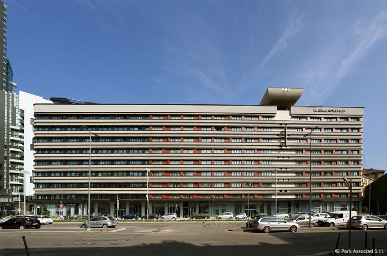
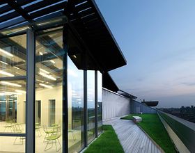
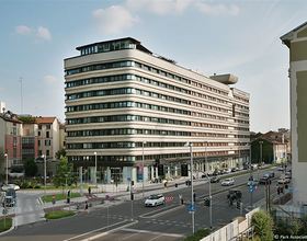
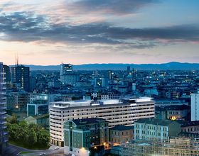
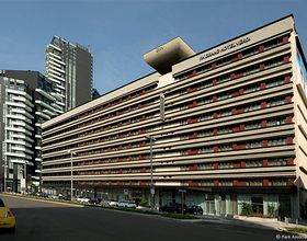
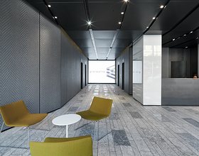
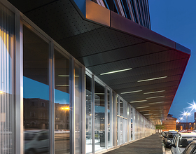
The building originally known as 'Residence Porta Nuova' was completed in 1973 to the design of Marco Zanuso and Pietro Crescini. It is representative of a series of built projects realised in the Porta Nuova area and remains an important indicator of the architectural activity of that period, typical of a particular climate in Milan. The 'horizontal' pattern of the building is one of its main features and our scheme has used this distinctive characteristic as a strong point in terms of the relationship with the street, acting as a contrast to the the verticality of the newer constructions. A thorough philological analysis of Zanuso's building, together with a new design direction concentrated on attention to detail, has endowed the spaces at Gioiaotto with a flexibility and internal brightness that is in keeping with contemporary architecture, supported by the prestige of a unique building that is very much part of Milan's history. The entrance hall immediately presents a contrast between rough surfaces that refract and others that reflect the natural daylight and artificial lighting at night. Inside the floors a large glazed section follows the horizontal structural grid and is divided vertically into three. The upper part, opaque and inclined, directs natural light onto the ceiling. The middle part, completely transparent and openable places the working environment in communication with the outside while the lower part alternates between filing cabinets adjacent to workstations and concealed fan-coil heaters. The rhythm of the glazing inside is highlighted by fins in extra-clear glass that increase flexibility by enabling the installation of mobile partitions as desired, while on the outside via the alternation of fins in extra-clear glass and coloured glass in light-grey. In front of the columns are boxes in micro-perforated bent-pressed steel. In the hotel part the rhythm of the existing windows is highlighted via the alternation of blades in transparent glass placed in discontinuity with the fins and timber boxes. As with the office area, the ground floor has a rhythm of transparent modules made from glass to guarantee maximum connection and exposing the accesses to the building at ground level, placed in discontinuity with the opaque structural parts covered by screen-printed windows on two levels to increase the three-dimensional effect of the facade.
Photo credits: Park Associati
1869 Projects

