SARCA SHOPPING CENTRE
-
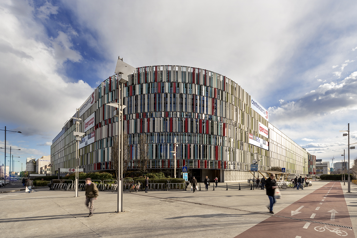
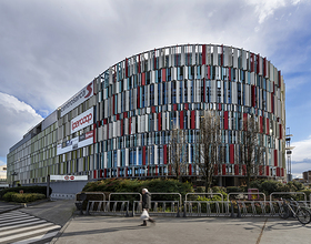
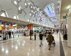
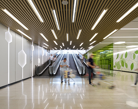
The project designed by Lombardini22 has embellished Sarca Shopping Mall with new colour schemes, forms, lighting and materials of a more natural and captivating nature with a view to enhancing the shopping experience and well-being of both shoppers and visitors. The awarding of BREEAM certification pays testimony to what has been achieved and the decision to focus on environmental sustainability.
Partly due to an upgrading of the merchandising and tenant mix, which has enabled full occupancy to be achieved, the results at the end of all the work are extremely impressive, with visitors showing increasing appreciation in terms of accesses and tenant sales.
The restyling project was based around a number of key concepts: the decision to transform the mall’s technological charm, embodied in the hardness of its constituent materials and a certain discontinuity in its forms, into something more homely, naturalistic and biological.
Then a re-balancing of the various parts of the mall, which were heavily weighted towards the hypermarket, to turn it into a more multi-faceted facility. Finally, an updating of the language the mall uses to communicate with both shoppers and the urban fabric in which it is located.
Homeliness and naturalness are embodied in every detail of both the interior and exterior space, from the furniture and choice of materials to the wayfinding, signage, and even the new coordinated image.
Photo credits: Lombardini22
1869 Projects

