PALEOCAPA 7
-
The project wants to bring back to ligh the identity of the building designed by Pietro Lingeri. The process is carried out through the study and research of the original features of the building.
The discovery of vintage photos take on the building-site at the time has been essential, as these images reveal the clear and formal simplicity of Pietro Lingeri original design, lost in the refurbishments and remakes over time.
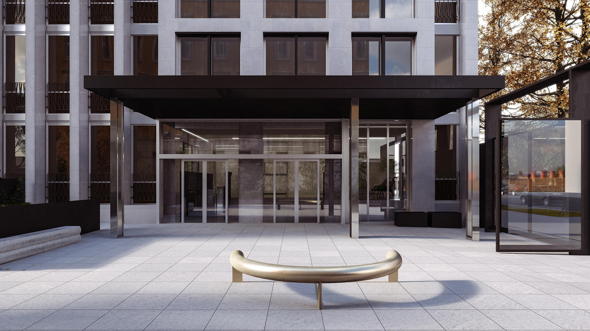
The first intervention concerns the opening on the façade, as their proportions needs to be revised. The redesign of the gate on via Paleocapa and of the entrance shelter are new elements and at the same time they dialogue with the proportions of the pre-existing ones, giving the building a renewed aesthetic and formal precision.
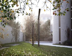
The green areas are redistributed and spots for users are created, so the garden becomes an expoitable space, a pleasant place where to take a break.
The interiors are designed in continuity with the outside, and are characterized by the use of stone, metal and glass.
Photo credits: Scadurrastudio
1869 Projects

