JOHN LEWIS DEPARTMENT STORE AND CINEPLEX
-
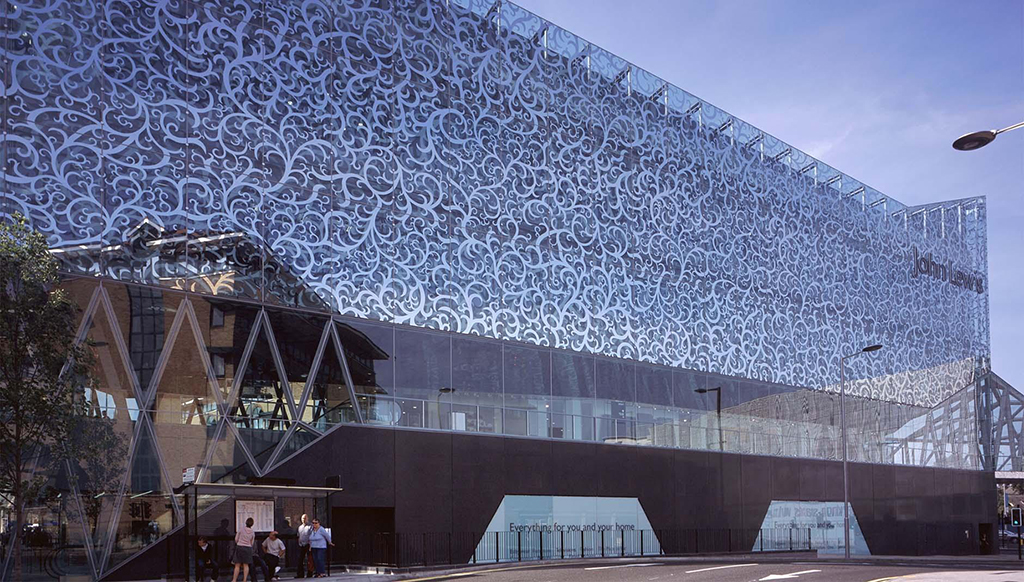
Commissioned within a larger city centre regeneration scheme, the John Lewis Department Store and Cineplex challenge the conventional blank envelopes which typify these buildings and explore ways for them to connect to an urban context.
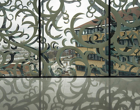
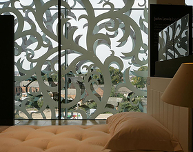
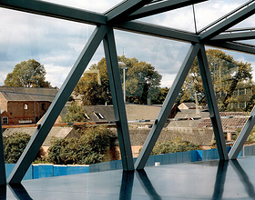
The department store skin has been designed as a ‘net curtain’ to permit interior arrangements to be changed without creating exterior clutter at the same time as providing shoppers with views of the exterior context and natural light.
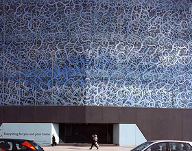
The pattern design is formed of four panels of varying density which meet seamlessly across the envelope, diffusing seams between glass panels and generating a sense of continuity in the pattern. Frit in mirror onto two layers of glass curtain wall, the mirrored pattern moreover reflects the context surrounding the store and in doing so, densifies as well as changes as the sun moves around the building.
Viewed frontally from the retail floors, the pattern on the double façade aligns and allows customers views out, whilst at an oblique view from street level, the patterns on the two layers appear displaced from one another and create a moiré effect, reducing visibility into the store and maximising privacy for the store to arrange the departments as needed. The resulting envelope is translucent and reflective and allows the store interior and exterior to engage with its context in varying ways.
Unlike the department store, the Cineplex which adjoins it, needs to be a blank box. It is enveloped in an opaque mirror stainless steel rain screen, corrugated in profile to produce with pleats along the perimeter. The rainscreen is designed to be assembled with 10,300 small, and thin stainless steel panels, arranged in an overlapping manner. This generates an envelope that appears quilted and refracts imagery projected onto it. The pleats, shingles and mirror finish together provide shadow, texture and colour, while the play of light on the surface creates continuously shifting imagery. The conventional blank Cineplex envelope is therefore transformed into a ‘theatrical curtain’ that engages its context.
Photo credits: FMA - Farshid Moussavi Architecture
1869 Projects

