EVELINA CHILDREN'S HOSPITAL
-
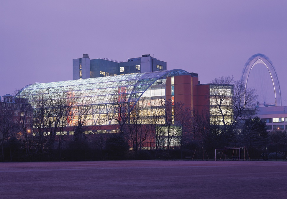
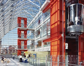
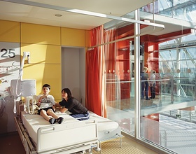
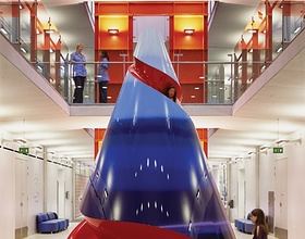
This was the first healthcare project of the firm where ideas pioneered in workplace design have been applied. Like offices, hospitals demand efficient and flexible layouts, with casual social interaction spaces. At Evelina, they broke with the typical layout of long corridors and bland wards, and planned a simple section of two long blocks flanking a central concourse, which rises the full height of the building. The three lower levels house shared functions - the Intensive Care Unit, three operating theatres, imaging equipment and the outpatient departments. Above are three floors of wards overlooking a spacious conservatory, under a great, curved glazed roof.
Photo credits: Hopkins Architects
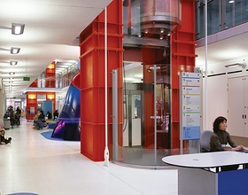
The base of the conservatory is the social heart of the building, called the Beach. It has views into the garden of Lambeth Palace, and is large enough for a café and waiting areas, with space for play sessions, lessons, exhibitions and informal performances. The wards, reached by two scarlet lift towers, have open plan day areas overlooking the conservatory, with private rooms on the other side. The whole building has a cheerful, sunny, colourful ambience.
The conservatory aids the sustainable servicing strategy of the building. It acts as a solar collector in winter and is naturally ventilated by stack effect in the summer. Throughout the building, partitions and services are flexible, allowing it to be adaptable in the future.
1869 Projects

