CAR PARK ONE
-
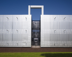
Elliott + Associates has set about to reinvent the parking garage experience. The reinvention begins with renaming the place “Carpark” and envisioning a place to store cars. With a focus on functionality, safety and compatibility with the campus, the new Chesapeake Car Park makes a positive statement about the corporation itself and the value they place on the quality of the campus environment.
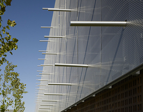
The exterior of the building features staggered metal panels which function to screen views of the vehicles and provide airflow to qualify the building as an open parking structure. Internal ramps and screening vehicles from view is visually harmonious with the adjacent structures. The metal panels match details on the adjoining office building. Brise soleil on the west side of the garage visually connects the adjoining office building. Horizontal panels vary in size, with 6” slats at ground level for human scale, and change to 1’, 2’ and 4’ widths as they rotate around the façade and add texture. There is no exterior lighting on the building. Internal lighting glows between horizontal panels.
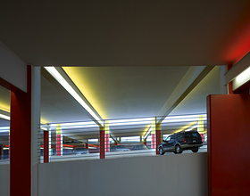
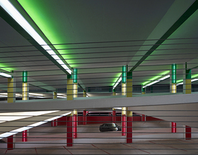
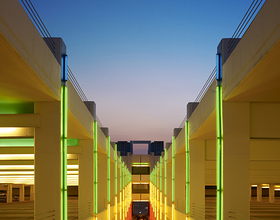
Light and color are introduced into the structure to make the building a destination. To accentuate colors and provide illumination, the Architects installed T8 linear fluorescent lights end-to-end on each cross beam to uplight the ceiling plane. The design team was mindful of energy conservation issues, acknowledging Chesapeake as a leader in the energy industry. The lighting control system turns on fixtures during peak morning and afternoon hours. During off-peak hours, the system turns off every fourth row of luminaires to save energy.
The landscaping materials are consistent with the existing corporate campus grounds and also exceed city standards. There is a rotating program of seasonal color and internal planters at the atrium which mirror the outdoor seasonal plantings. Coloratus, an evergreen groundcover, provides a buffer at the building edges, softening the edges and perimeter, providing seasonal color and preventing damage from lawn maintenance equipment.
Each level of the car park features a primary color – Red, Yellow, Green, Blue and White – for users to easily navigate through the facility. Elevators are placed on the destination side with windows so users can visually connect the garage and their destination. The stairs improve the experience while being useful. Lighting was added in the stairwells to emphasize the color and level connection and to provide an atmospheric journey.
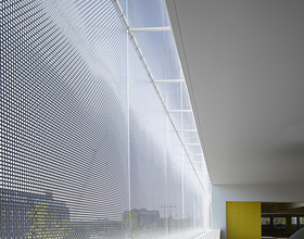
A surprise element is the full-height; 13’ wide lighted atrium contributing to air circulation. The atrium contains a light sculpture using the floor level colors. Natural light is allowed into the atrium center making it safer and providing a relationship to nature.
Photo credits: Scott McDonald
1869 Projects


