79&PARK
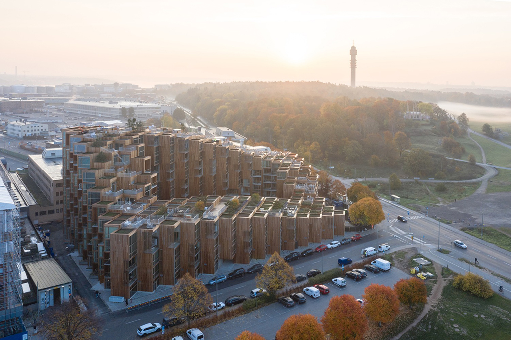
Located on the edge of Gärdet, a treasured national park, Kullen makes conscious decisions to provide a sensitive, respectful form while allowing the same choices to simultaneously manifest as exceptional residences with spectacular views.
In direct response to the context, the northwest and southeast corners take the heights of their immediate neighbors; while the northeast corner, farthest from the park and nominally with the worst view, is pulled upwards to grant it the most spectacular views of park and port.
The southwest point of the building extends farthest into Gärdet; and to create a humane edge between building and nature, is pushed down to the lowest profile, transforming it into a public platform with a 270 degree view of parkscape and simultaneously freeing the majority of the residential units to views of the park. The same move also ensures that the central courtyard will always receive copious amounts of sunlight. In further deference to Gärdet, the massing is visually reduced through a language of pixels, scaled to the human form.
This manipulation not only allows for a more organic expression, perfectly reflecting the surrounding landscape, but also provides a way to accomplish the building topography in a controlled and inexpensive way through the use of prefabricated units of standardized sizes.
Photo credits: Laurian Ghinitoiu
1869 Projects


