YCONE
-
The Confluence is an emblematic urban hub that will become historic, representative as it is of the 2000s and 2010s. The word ‘confluence’ suggests meeting, convergence. In this part of Lyon, there’s the meeting of many different individuals and social actors and the convergence of a great number of styles. It’s been a pleasure to be involved in such a cultural hotbed and the whole process of liberating renewal, where every project needs to find its place.

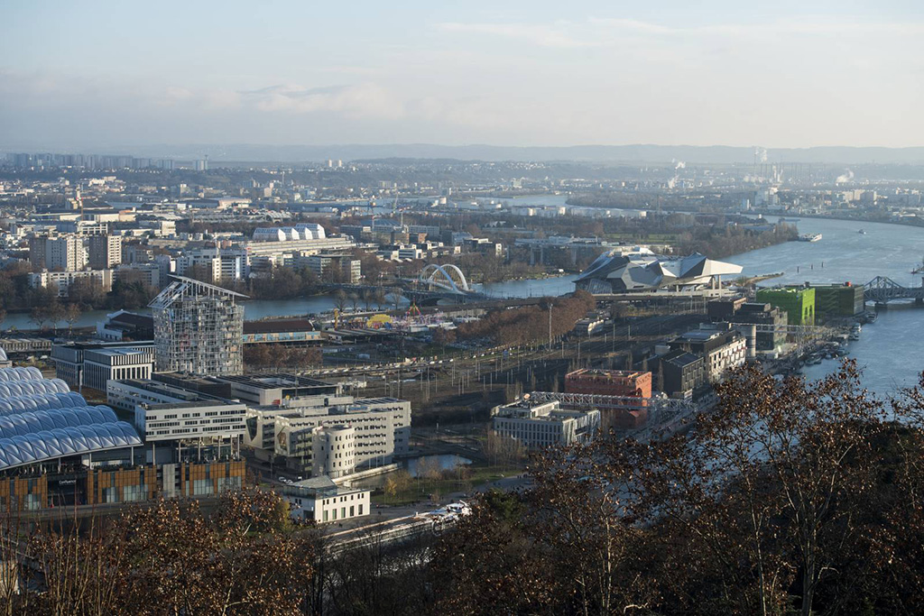
I don’t think it’s all that easy to read the neighbourhood in terms of urban strategy. What we need to do, then, is work out how to make this meeting of currents livable. The ideas that have fuelled our project are a result of the location.
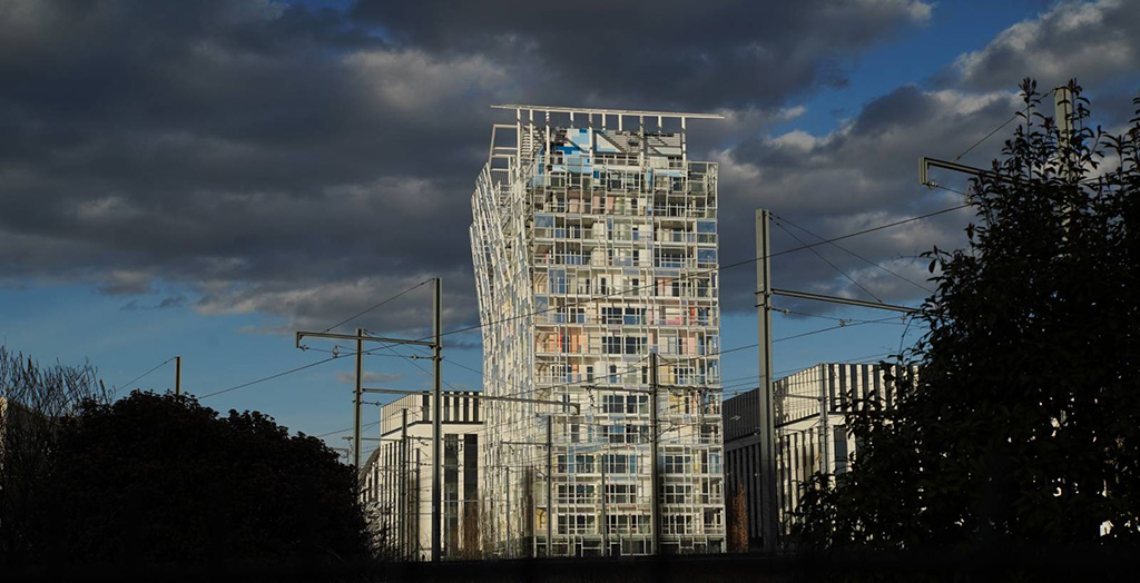
Ycone will be bordered by pre-existing buildings in an urban development that will be part of a world to come. So, it was important to see what could happen: we’re not making sense for today, but for a programmed future – with all the risks that that implies: in urbanism, things that are programmed can vanish without a trace from one day to the next.
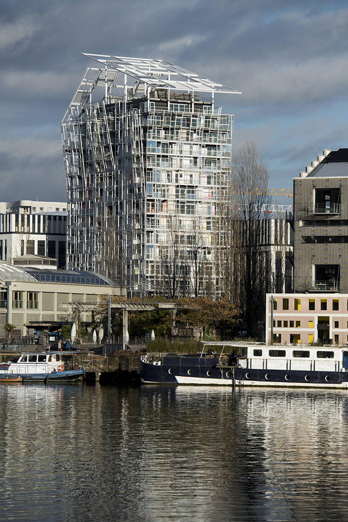
What I’ve tried to do, then, is develop positive features. Ycone is a program with a lot of mixed-use space. We’re providing apartments, but those apartments are not automatically destined for the same people, people from the same social category or with the same aspirations. Ycone will also accommodate retail outlets. The project will be faced with office blocks and sit alongside a railway. Its scale is slightly bigger than average, too. But Ycone isn’t aiming to be a city ‘monument’: this building will be part of the life of the new precinct and needs to have its own identity.
Location
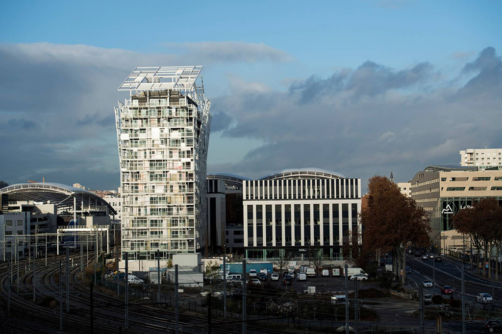
When I’m designing a project, I often talk about ‘the missing piece of the puzzle’. In Confluence, Ycone will be surrounded by three projects and its place is predetermined. I tried to turn the building round a bit, to push it to one side, then push it to the other side, to work out how I could set off a positive conversation with the neighbouring buildings. But that discussion was based on two conditions: urbanity and amenity.
I began by creating a sort of green filter that will allow the people who live here to feel good, to feel at home, to not be unaware of the neighbours and even to offer them a gift. The filter will also allow the building to be identified as a slightly quieter place than its neighbours and allow us to introduce a public space around the building, which will be at the centre of that space – even if this is a micro public space, offering different levels.
The building, then, is anchored to a base, on a terraced garden. We’ll even use this to tuck away visitors’ cars, hopefully discreetly and elegantly. The position was the first challenge. The worst response would have been to design a building like every other building produced by an automatic urban system – like the ones we see most of the time, sadly, in today’s non-cities.
Landscape
The landscape speaks volumes, whether it’s close-up or in the background. First there are the different horizons, the line of the mountains, the undulating relief. There are the railway tracks and the trains. I love the poetry of the railway and I think it’s pungency will only intensify and be more and more freighted with nostalgia over the coming decades. We need to preserve the distant landscapes, and several apartments will be able to enjoy them; and we need to preserve the close-up landscapes too, along with an awareness of being part of a city that’s in the process of being built.
Living here
Living somewhere, in my view, doesn’t just mean setting yourself up in an apartment. It also means opting for a way of life. What I dread most are those standardised spaces based on the number of square metres and the price at which you can sell them. This gives places the same dimensions every time, the same typologies – so much so that, ultimately, people feel like they’re just a number and tell themselves they’re just passing through. We have to create places where people want to stay and are in a position to tell themselves that they really are at home.
For this to happen, you have to feel comfortable. The first creature comfort is not to be at the mercy of your neighbours. Everything that goes towards protecting privacy, private life, is paramount. With that in mind, you don’t just create façades that residents can draw the curtains across. We need to find ways of living under the watchful eyes of others. We also need to create features that allow us to say I’m at home here and everything’s different because I’m at home.
In urban environments that are not, in my view, totally urban, we’re already in contact with a certain form of nature, a certain landscape; we want some kind of external element. Whenever I can, I try to create these intermediate spaces that allow people to go out just because they feel like getting a bit of air, like thinking of something else, or hiding, or showing themselves… Such intermediate spaces are in continuity with the space lived in, they’re an extension of the apartment – an imaginary extension, above all: at my place, the apartment doesn’t stop at the same old three walls and four windows. There’s a way of projecting yourself into a depth that means telling yourself: maybe I could live here and have an impact on this chosen spot. There’s also the sense of not having the exact same apartment as your neighbour.
I try to fight this notion of a ‘number’ in a city, meaning this person who inhabits the same place as everyone else. Unfortunately cloning is a worldwide epidemic and it’s hard to get away from it because of production requirements.
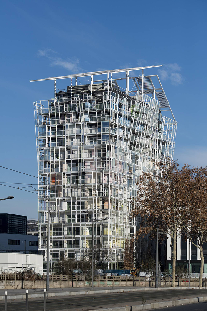
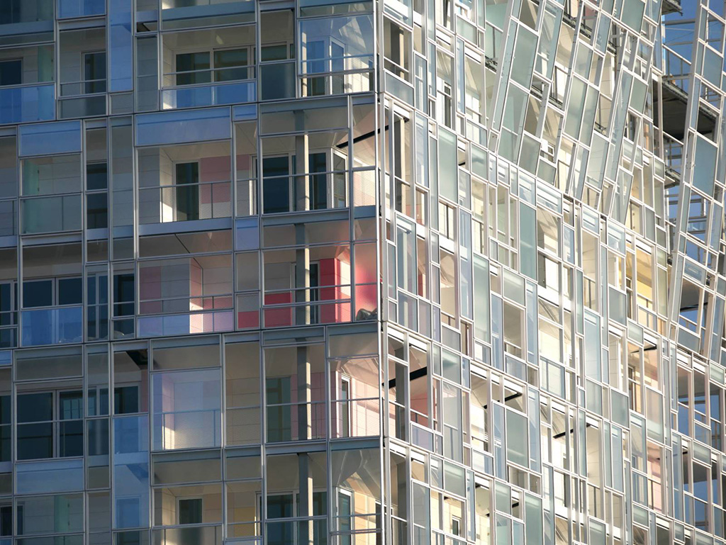
Thanks to a second façade that’s very light and only partial, Ycone plays down similarities and creates differences – in light, feel, and of course, planes – even if the differences are slight; above all it plays on differentiation, at the level of each objective element. Because the orientations are different, the four façades are not the same. When you cover all bases like this, normally, things improve. But you have to really express these differences.
Ycone will provide apartments belonging to different categories of financing or access to home ownership. It will give the impression that there are buildings inside the building. The top of the building won’t be the same as usual, either. There’s nothing worse than buildings by the metre where the top floor is exactly the same as the one below. We’re going to give a lot of joy to the people lucky enough to be able to live up the top, but we won’t forget the residents who live below. This spirit of difference, of outwardness, of picking up what’s happening outside or shielding yourself from it, will be available to all the apartments.
Structure
Ycone will signal that there are two buildings in one. The project will offer low-level apartments more height and allow for the possibility of two apartments being sold together – something that sometimes happens – even if they’re not in the same category. What we want to ensure is that the typologies always raise questions to which there are no answers. The architect needs to create something akin to a film script, a sort of fiction that might make sense to those who live there. There’s nothing worse than finding yourself back at square one with an artefact that raises no questions at all.
Facades
I’ve designed a façade over two planes and worked on what happens between the two. This gap will be a living space, an in-between area, what the Japanese call ma. People are going to live there, have their breakfast there, have dinner, walk through, put in potplants… The two façade planes will superimpose two compositions that then form one slightly deeper composition. This can be read as unstable, but obviously it’s not. The result is tied to a certain number of constraints. You’ll try to frame things from the inside, try to shield yourself from certain things. The result, seen from outside, will depend on the set of constraints that get revised, adjusted, and embellished if possible by the story that’s brought us here, and we’ll try to take that story a bit further to make it more perceptible.
Views
In this project, I’m doing one thing only, which is to frame, all I do is frame. I love framing. When you decide to live somewhere, you like to choose what you’ll be looking at. There’s a lot more poetry, a lot more mystery, in a fragmented, curated, focused view than in an opening that offers a view as a whole. That kind of opening has a flat, not to say pornographic, side… It can sometimes be called for when you’re facing an exceptional panorama: the ocean, say, for which you need to go with all the horizontality; or a mountain range, which you don’t feel like chopping up into little bits. But more often than not you feel like choosing the frame and letting yourself be open to an imaginary space outside the frame, the way a filmmaker tries to get us to see what’s outside the frame.
This project is based on different kinds of framing. The inner skin frames the outer skin which itself takes up elements of an esthetic vocabulary familiar to the world of the visual arts, one that’s extremely geometric, extremely orthogonal, reminiscent of the heyday of modernity. Each window will be a composition in itself. When you move behind the window, since there are gaps of one or two metres between the two skins, what you’ll see at the side won’t be exactly the same as what you’ll see face-on… The windows will invite exploration, incite curiosity, maybe provide an incentive to go outside. This is also a way of showing that the building has depth. Behind a first ultra-light façade, there will people living, even if this is not entirely on display. You won’t be able to really work out what they’re doing… This interplay of façades will offer more than a direct reading of the project, it will offer a kinetic reading as well.
Green belt
The green belt will be very important for the people living in the bottom apartments. The ones high up will obviously be able to see over it. We’ve chosen relatively tall trees so that, at a height of from 15 to 20 metres, you’ll be shielded from the buildings opposite. At ground level, the tree trunks will be bare so you’ll be able to see the shops and building entrances. This means there’s stratification: the higher up you are, the lighter the branches and foliage. So, the interplay of filters is different at each level. This is a serious courtesy to all the people who’ll be living at the bottom of the building, who’ll be living in the neighbourhood, as well as all those visiting the building.
External materials
I’ve tried, to the best of my powers of understanding and interpretation, to respect the specifications laid down by my friends, Jacques Herzog and Pierre de Meuron, and to thereby play on the pattern of punctuations in white. But there are different kinds of white, all kinds of hues, as the American artist, Robert Ryman, has shown us in his white canvases. I’ve also decided it would be good to use certain colours that conjure up the old Lyon – even if the old Lyon has taken on shades that aren’t quite as appropriate as we might think. Debates are still raging over colours that have practically turned Lyon into an Italian town. For Ycone, a bit like a homeopath, I’ve diluted a drop of colour in white so as to leave a trace of pastel that will create variations of colour through overlaying. Each façade will have geometric compositions and chromatic variations. Something needs to happen here that’s as artificially natural as possible. It needs to look natural, but obviously, as with anything natural, this generally requires a bit of thought.
Photo credits: Ateliers Jean Nouvel, Guillaume Perret
Countries: FRANCE
Categories: HOUSING
Designer: ATELIERS JEAN NOUVEL
Status: Completed
Inaugurazione: 2019
1870 Projects
Mediapyramid ARCHITETTURA

MEDIA PYRAMID COLLEGATE